Make Your Fashion Blog Visually Pretty, Clean & User Friendly
When I go to other people’s fashion blogs to check them out, share some love, and see what other people are up to, one of the first things I notice before I get to the content is… the layout. I’m sure it’s not just me who does this, but whenever I come across a blog with a layout that looks gorgeous, I just have to comment on it and it makes my reading experience that much better! There’s nothing worse than not knowing what the latest blog post is, where to click, how to even navigate to the posts, or read what the text is saying when it’s against a glaring background.
These are just some issues that fashion blogs can have and I wanted to do a blogging advice post in my series about how to make your blog visually appealing and practical. You work hard on your content so it should be displayed in all its glory, right? Here are some tips of mine that I have picked up along the 9 years of my blogging journey on various different websites, but they also come from my perfectionist streak and a few minor issues with neatness, but in my opinion, they really do nothing but help you in every way possible, so it’s important to at least read them.
Choose The Right Theme/Template
The first and most important part of getting the right template or theme for your fashion blog is choosing the right template/theme to showcase it. Now this depends entirely on what your content might be and your personality, but you need to choose one that’s easy to use, minimal, and functional. I used to scour the internet for days looking for themes to use and now I go nowhere else but Pipdig (this isn’t sponsored by Pipdig). The themes there are absolutely perfect and so easy to use, you wonder what you were doing without them in the first place. They do both Blogger and WordPress themes, so you won’t miss out. If you’re more into a personal way of blogging, then choose one that suits your personality, or if you’re into reporting on trends like a magazine, choose a simple and classic black and white layout. Your template/theme is the base of your blog (of course you can customize them to how you want) so choosing the right one is key to displaying your content in all its glory! Some tips to look for when choosing one:
- Does it have a custom header and personalisation options?
- Take the size of the content and sidebar columns into consideration.
- Can you make your own navigational menu?
- Can you display your social media and image widgets in the sidebar?
- A slider is something you might want to consider for promoting your best work.
- Is this theme optimized for SEO purposes?
- Does it match your blogs voice/content and your personality?
- Most importantly, is it easy to use and navigate as a reader and as an owner?
All of these points above are important and they make part of checklist to ensuring you are getting the right theme. If you’re a hobby blogger, you can just choose a free option from the WordPress or Blogger list that they have ready available and more often than not, the WordPress 2015/2016/2017 layouts are optimized for all of those options already, but they are hard to customize unless you know what you’re doing. If you are a business blogger and you are self hosted, it’s worth investing in a paid for theme like the ones on Pipdig as they meet all of a fashion bloggers criteria! I often see lots of bloggers using their themes. There’s nothing worse than getting a new theme and not knowing how to use it because it’s coded in a complicated and unusable way. That’s happened to me before!
Visually Appealing Layout/Theme
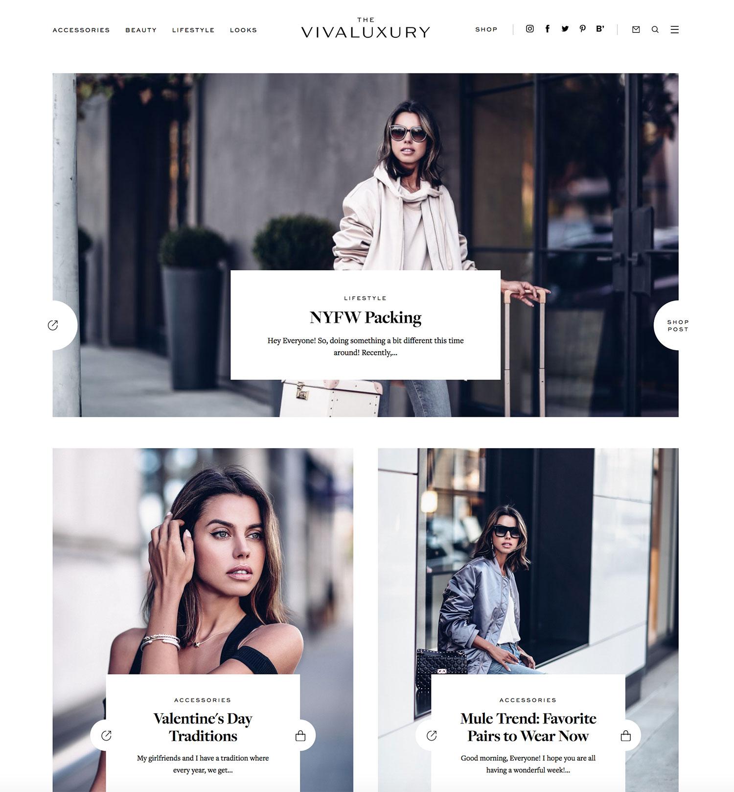
Now you have your theme, you need to think about making the layout as visually appealing as possible. If you’re a fashion blogger, a simple text logo for your header often works best, followed by a slider of your best work, then your content below. You want to think about making sure your blog posts are the focal point, so a clean white background with black text is often the choice. Vivaluxury (above) is a great example of how clean and pretty a great layout can be in black and white, but if you do want to make things more personal, Wish Wish Wish does a good job with muted pink (see here). Some things to look for when creating your layout:
- Show off your best posts in your slider – nice and visible at the top.
- Make sure your logo is not too big or too small, you want to see content above the fold too.
- Don’t display ads in ugly places.
- Keep the text black on a white or muted pale coloured background so it’s easy to read.
- Have your social media links in an easy to find place, along with the search bar.
- Along with SEO reasons, excerpts and previews of blog posts are best for easy navigation.
- Make sure everything is neat, centered where it needs to be, and clear.
- Instagram feeds along the footer are often highly clicked and they look pretty.
- Make sure your images fill out the full width of the content column.
- Have clear headings, paragraphs, and structure to your blog posts.
So the general rule of thumb here is to make sure your personality shows through in your layout, but to make it easy to use and set out well. You can either display your content on the left or right with the sidebar on the opposite side, but I don’t recommend two sidebars as that really starts to impact your content column. I choose to personally have my sidebar on post pages only and not on the homepage so that my homepage is really easy to navigate and use, but a lot of people choose to have it on their homepage – it’s a matter of personal preference. As long as your theme looks clean, pretty, well structured, and displays your content nicely in full size for your column width, you’re good to go!
High Quality Photos
Since us fashion bloggers work so hard on our images, isn’t it best to make sure they are the best they can be? I started out with just a simple point and shoot digital camera about 7-8 years ago, and would sometimes even use my phone, so the quality of the photos wasn’t great at all. As time went on, we switched to a DSLR Nikon and then upgraded twice, currently using a Nikon D610 with an 85mm Prime lens. The photos that this camera produces (shot in raw) are amazing. The detail and quality that shows up is incredible and it really helps that I now use retina images on a retina screen.
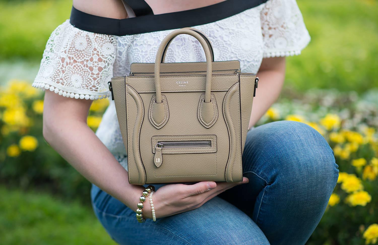
If you have a Apple MacBook from the last 2 years or you have an iPad or iPhone, you will have a retina screen. Since I am an Apple user, I’m not sure which windows or android items have retina, but I’m sure some of them do. If you’re not familiar with the term, it means your screen is made up of more pixels, which means it displays more of the image, meaning that lower quality photos look really grainy and fuzzy. One way to combat this is by making your images retina ready. I wasn’t sure how to do this at first, but it’s easy and all you have to do is make your photo double the size of your content column so that it shrinks to fit. As an example, my content column is 750 pixels wide, so my images are 1500 pixels wide. They shrink down to fit into the column, but the quality of the photo is increased because the retina screen picks up more of the detail. So I recommend definitely making your photos retina ready as that’s the way the future is headed. I know a lot of the top bloggers do, but many still don’t. An example is my Celine bag above, if you use a retina laptop, you will be able to see every grain of the leather in detail.
I could actually make a whole blog post dedicated to photo quality and having them visually appealing, and maybe I will at a later date, but the best advice I can give you is to invest in a great camera for your photos if you want them to look professional. Make your images retina ready. Edit them in Photoshop so that the colours and sharpness etc can be improved, making them even prettier, and having good angles. Obviously the photo subject is up to you entirely, but blurry, dark, badly lit, grainy, fuzzy, dull photos are a huge turn off for most people. Make sure they are pretty, high quality, well lit, clear, realistic pictures. It might take extra time, but it’s worth it, especially if you are blogging as your career, trust me. Flattering angles are just as important too, don’t forget that.
Easy To Navigate
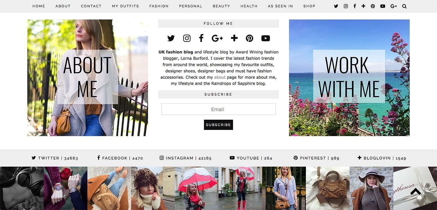
I’ve included a screen shot of my footer area of my blog, as well as the menu as it’s a sticky, so it stays at the top of the blog no matter where you are on the website. Having a clear, well set out navigational menu bar is key. How many times have you been a fashion blog and you can’t find the search box, the social icons, or even a certain category? I have numerous times and it’s unhelpful for where I’m trying to go or what I am trying to find. In fact, it puts me off to be quite honest.
A huge piece of advice is to make sure you have your navigation menu at the top of your blog (or under the header) and it needs self explanatory names of your sections. Things to include would be: Home Page, About Page, and Contact Page as the three must haves in there. You then need your other categories which relate to your blog. Outfits, Health, Beauty, Fitness, Fashion, Shoes, Bags etc are all important, especially if you blog about these quite regularly. People want to be able to go to that specific section to find things.
I put my general categories in my menu bar and then I also include images with text on them in my sidebar so that people can click through to sub categories. I have one for bags, shoes, costumes, asking questions etc. so it’s a great way to make sure it’s even easier to navigate. I have my Instagram feed in my footer with my social media accounts numbers above it, plus a work with me page, and an about me page, both at the bottom in case people have navigated that far down. I also include my popular or top posts (either in the sidebar or where your layout allows it) and I have drop down boxes for all of my categories and archives. That’s just what I do, but a lot of other fashion bloggers do the same thing and it’s extremely important to make the user experience on your blog as easy as possible. Make sure everything is visible and that the search is easy to find. Keeping it in your menu bar or at the top of your blog somewhere is ideal. Also, include a little text bio about yourself to help readers familiarize themselves with you straight away, that’s always a nice extra touch.
No Overlapping Issues, Flashing Emojis or Bright Backgrounds
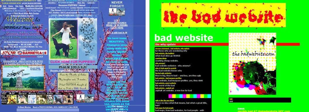
I almost didn’t want to include these 2 images above as they send me insane when I look at them, but in order to share with you how important the layout and making it visually appealing is, I had to. I am not trying to condemn the owners of these sites, but they are living proof of how the layout and theme can affect your blog tremendously. They don’t need much explaining as they speak for themselves, but I will say what my views on them are.
Having a bright or pictured background is really annoying when you’re trying to read text. The left one shows that you have no idea what you’re reading as the text blends in with the background, which doesn’t even fit on the whole page. You can’t distinguish between posts, banners, images, and ads as they are all mixed in together, and the fact that the text overlaps lines and borders is highly annoying. The one on the right isn’t as bad, but the glaring colours and lack of respect to stay within borders, as well as tell what is a new post and what isn’t, is highly obvious. You should keep these tips in mind:
- Avoid bright, glaring, eye searing colours and heavily detailed backgrounds.
- Stay away from flashing emojis and big sparkly pop ups.
- Don’t have overlapping text and images which fall into borders.
- Have your content column away from ads and other visuals so it’s clear that it’s content.
I hate going to a website that has flashing things all over the place like it was written by a 10 year old girl (if you are that age, it’s fine) and when the images don’t fit into the content column, that bugs me too. Sometimes images have been so large they are outside of the column by over 70% and you have to scroll left or right to view them all, which doesn’t work as they’re just too big to even understand what the photo is actually about. When text goes outside the borders and off into no man’s land too, that’s hard to read. Keep things neat, clean, easy to read, and well structured. You don’t want people being put off immediately upon landing on your blog, you need to keep them interested.
So, those are my tips on getting your fashion blog to look mature, professional, clean, clear, visually pretty, and practical, all at the same time. You obviously want to avoid spelling mistakes and grammatical errors as much as possible as too many of those can make your blog look unprofessional, but as long as you have a fantastic looking layout and theme, and you take care with your photos and post structure, any small errors that crop up now and again will easily be forgotten. Do you have any other tips you’d like to offer? I would love your advice on this subject too!
Image Credit: Elegant Themes, Kristina Wilde, Dizzy Brunette & Pipdig.
Discover more from FORD LA FEMME
Subscribe to get the latest posts sent to your email.


Great tips Lorna. I have been into Minimalist web design for a while. Your site looks great, super clean and easy to navigate. Glad you use a Nikon! I have the D3300 and have purchased two other lenses for it, a Nikkor 70-300mm and recently, a Nikkor 35mm/1:1.8 G primary. Love the Primary lens! It’s great you too use a Mac. I have a MacBook Air 11 inch tiny screen. I hope you’ve been feeling better. 😊☀️
Author
Thanks, John! Yeah Nikon is great isn’t it? I’m sure Canon is good too, but we never used them. The 85mm Prime lens is good for us, but we are trying to invest in a Sigma 35mm as well for close up shots. I like the layout of your blog though, it’s nice!
I had a Canon, thought to try a Nikon this time and wow, much better cameras. My camera goes to work with me every day, you never know when a great photo opportunity could come along. Thanks for the complement on the site, I alter it’s look once in a while but have been drawn to the Minimalist design for a long while now. this focuses viewer’s attention to the content. Be well!! ❤️🇬🇧
Author
Yeah, you do capture some amazing sunsets and shots on the way to work it seems! And that’s good to know that you think Nikon is better than Canon!
I can’t say exactly why but Nikon just has the edge over Canon products.
Author
That’s great to know, I never feel the need to change now, ha ha.
I think your advice hold good for blogs on all topics. I don’t read a huge number of blogs but upon visiting one for the first time it’s always pretty clear pretty soon whether or not I want to keep hanging around. 🙂 Your layout is very appealing visually and it makes the reader feel comfortable before they’ve even engaged with the content. 🙂 I think you’re absolutely at the top of your game.
I can only see one tiny, tiny, tiniest fault on your site and I don’t think it’s even something that is within your own control – but the list of languages on the Translator drop down menu are not quite in alphabetical order. I only noticed this because I was curious to see the text in Dutch (as I’m teaching myself Dutch) and at first I thought it wasn’t on the list until I went further down and found it. 🙂
Anyway, keep up the fabulous work, Lorna. 😀
Author
I’m glad you agree, Steven 🙂 I think the layout is so important, it’s one of the most important things there is. Unfortunately the translator isn’t something I can change though, it’s a plugin that someone else made and it comes standard, so I can’t arrange the languages which is a shame. I have no idea why they never put them alphabetically when they made it, it’s confusing to me too, lol 🙂
This was a nice post to read. Very informative and helpful. Thank you!
Author
Glad you liked it!
I enjoyed reading through this post. I agree, I love a clean, easy to navigate and one with great content/photos blog.
http://www.fashionradi.com
Author
Thank you! I am glad you liked it!
I’ve never heard of pipdig. Thanks for the recommendation. I’ll definitely check it out.
xx Yasmin
http://banglesandbungalows.com
Author
I think you will like them!
Beautiful minds inspire others! Thank you for this post, is amazing!
xx
Mónica Sors
MES VOYAGES À PARIS
NEW POST: RUFFLE TOP AND VELVET LOAFERS
Author
Thank you!
These are great ideas on how to embrace one’s blog design! Nothing is more irritating than not knowing where to click for the latest post. Even though it’s fun to see the most popular ones, it’s not as fun to comment on a post that’s 5 months old! Xx
http://www.thefashionfolks.com
Author
I’m glad you think so!
These are very good tips, dear Lorna, and I think you are totally right about everything. I tried my best to keep the colours of my blog neutral, since I love colours. The quality of my pictures may not be the best, but well, O publish pictures for a certain reason (that is not my main reason, but people wouldn’t visit without pictures, unfortunately). I was about to change the header of my blog this year, but after months looking for something I liked, the one that I really really liked was… still the old one 🙂 I agree with you that some blogs are difficult – I don’t know which was their latest post. So yours were very good tips! Hope you have a nice week!
DenisesPlanet.com
Author
I think your header is unique, I always recognise it when I come to your blog so I know instantly it’s yours 🙂
Really nice themes !
http://clothespaper.com
Author
They do have some great ones!
These are such great tips! Totally helpful!
Edwige | http://www.hypnozglam.com
Author
I’m glad it helped!
Fantastic post, I very like it 🙂
new post
https://www.instagram.com/ilijac/
http://mensfashionobsession.blogspot.rs/
Author
Thank you 🙂
You really have some great tips here, like I read it once but I am definitely book marking and coming back to read it properly. I also use a pipdig lay out, the luxury theme and I love it! The only think I have not added as I struggled with it for some reason is the drop down arrow in the content category and I see you have yours sorted… I also still need to add a few things and actually spend a few hours on my site its just getting the time shew… but anyway, really great post and I hope you have a good Monday hun xx
Author
I’m glad you like the article and find it helpful! The drop down in the menu is done in the back end of WordPress, you have to put the items within the main one in the menu maker. I hope that makes sense!
Such nice tips !
I all agree with your tips.
xx,
Margot
https://troughthepasturesofthesky.com/
Author
I’m glad!
Excellent tips! I think that theme, color and fonts are even more important than the content. The first thing I do when I enter the blog is checking what’s in there and how does everything look. If that first glance makes me think this might include some high quality content, I start reading.
One thing that’s also important is making sure the theme you use works well in both mobile and computer screen. Sometimes I see nice blogs that are impossible to navigate with my phone. Many of us are browsing with a mobile device so it should be any bloggers concern if the page is not optimized for mobile too.
Author
Definitely a theme that’s optimised for mobile and tablet devices too! Luckily Pipdig ones look great on mobiles!
I have been been following blogs for over 6 years, with all the time I can see who takes the time with theirs to who spends very little time. Maybe because you make money with your blog, I find it one of the nicest looking blogs. xox
I know when I started mine was awful looking, lol… I was lucky enough to win a blog make over a few years ago and it looks much better… although I do think it’s time to do an update soon, a treat I plan to give myself when I can find someone to do it for me xox
Have a great week Lorna xox
Author
I think yours is really easy on the eye though, Launna. Thank you so much for the compliments on mine, but like yours, mine was terrible when I first started too, but my need for perfection took over plenty and now I can’t rest until every single detail is right, even if it’s just a mm positioning, ha ha.
Wow Lorna this post is extremely helpful and well-written, with lots of interesting details and examples. It’s essential reading for any blogger or aspiring blogger! I agree, it’s certainly distracting when there are images which flicker on a blog and cause eye strain, and a crowded layout also makes it difficult to choose a point of focus.
I will be referring to your blog post again to get inspiration for my blog layout! Thank you so much for being generous with your knowledge, and for writing a clear and useful guide for creating a professional-looking blog.
Lots of love Saba xx
http://www.trulymadlydeeplyfashion.blogspot.com
Author
You’re very welcome! I hope it’s really helpful and let me know if you need any tips on the layout or anything!
Thank you Lorna, that really is so kind of you! You’re always so helpful, and I’m very appreciative of your support. xx
Author
Of course!
I’m really loving your tips! I happen to have the same theme as you do, and yes Pipdig is my go to place! their service is also impeccable! I’m looking forward to reading more of your content! new blogloving sub here hahahaha
http:///www.stylememoires.com
Author
Oh thank you for loving my blog! I really appreciate that! I do agree, Pipdig are amazing!