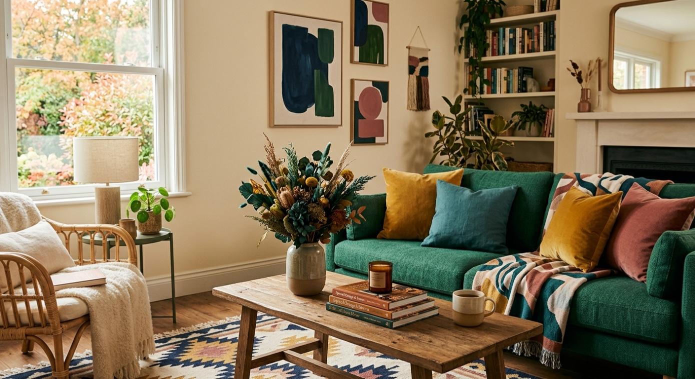
It’s no secret how autumn/fall decorating typically brings to mind hues like chocolate brown, burnt orange, deep red, and golden yellow. These classic shades undoubtedly have an appeal, but there are countless other ways for you to evoke a warm and inviting feeling as temperatures start dropping. Unexpected colour palettes can also capture the richness of the fall season, all while ensuring that your interior design maintains a personalised, fresh aesthetic.
From soft greens and moody blues to creamy neutrals and sophisticated purples, below I will be detailing some of the alternative fall palettes that provide a lot of inspiration for home and wardrobe refreshes!
Warm Cream & Deep Blue Help Create A Sophisticated, Cosy Ambience
Midnight blue, navy, and dusty indigo likely aren’t the first colours you think of when it comes to autumn, but they offer a unique depth that makes them a great choice for the cooler months of the year. And when paired with ivory, warm cream, or oatmeal, these types of blues develop a calming and balanced palette.
Consider incorporating deep blues through accessories like curtains, throw pillows, accent chairs, or a textured blanket draped across your sofa. Natural wood and cream upholstery will soften the contrast, which can be important when you don’t want darker shades overwhelming the space’s aesthetics.
And for that perfect finishing fall touch, use warm lighting, brass accessories, or woven baskets to add visual depth and allow the blues to be more distinctive.
Dusty Pink & Olive Green Bring Nature Indoors
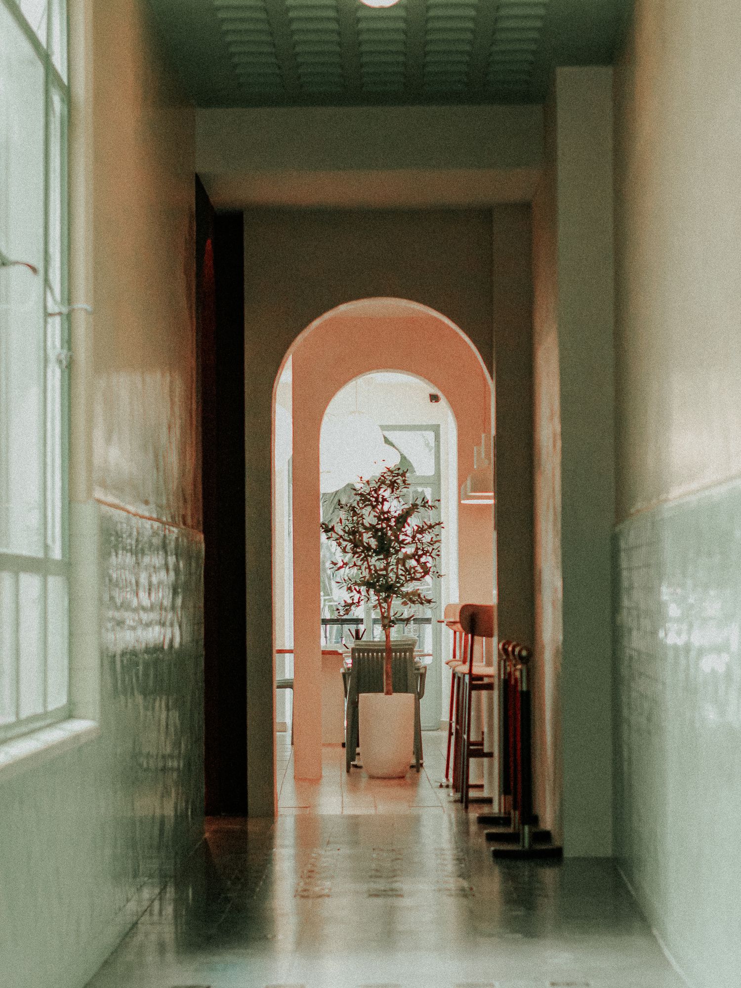
Green is a natural choice for fall décor due to it echoing evergreen foliage, changing landscapes, and the countless earthy tones of the great outdoors. Inside newer homes, this often equates to shades like moss, olive, and muted sage providing a grounded décor foundation, which can often be complemented by dusty pinks for an unexpected softness.
This unique combination tends to work particularly well in living rooms, bedrooms, and reading nooks. For example, an olive accent wall can be a great backdrop for pink-toned artwork and cosy throws. For a more subtle approach, try utilising greens in your home through ceramic vases, houseplants or upholstery.
Natural materials tend to help tie this specific palette together. Aged wood, wool, linen, and stone can bring added texture to your room and avoid an overly polished vibe, which results in a more organic and comfortable feel that’s not too heavy on cliché fall motifs.
Soft Lavender & Burgundy Provide An Unexpected Fall Pairing
Although burgundy is a somewhat familiar autumn colour, pairing it with muted lilac or soft lavender creates a contemporary twist that most of us are just beginning to learn. This type of contrast creates a layered palette that feels incredibly elegant, as opposed to predictable.
This special combination is particularly effective in bedrooms, dining rooms, and entertainment spaces. For example, burgundy accent pillows or curtains can provide depth against lavender artwork, flowers, and smaller textiles that introduce lighter elements.
Whenever you’re hesitant to combine noticeable colours together, start your design with a more neutral foundation. This could come in the form of beige upholstery, warm white walls, and natural wood, allowing the burgundy and lavender to stand out in a way that enhances a room’s depth and doesn’t compete for attention.
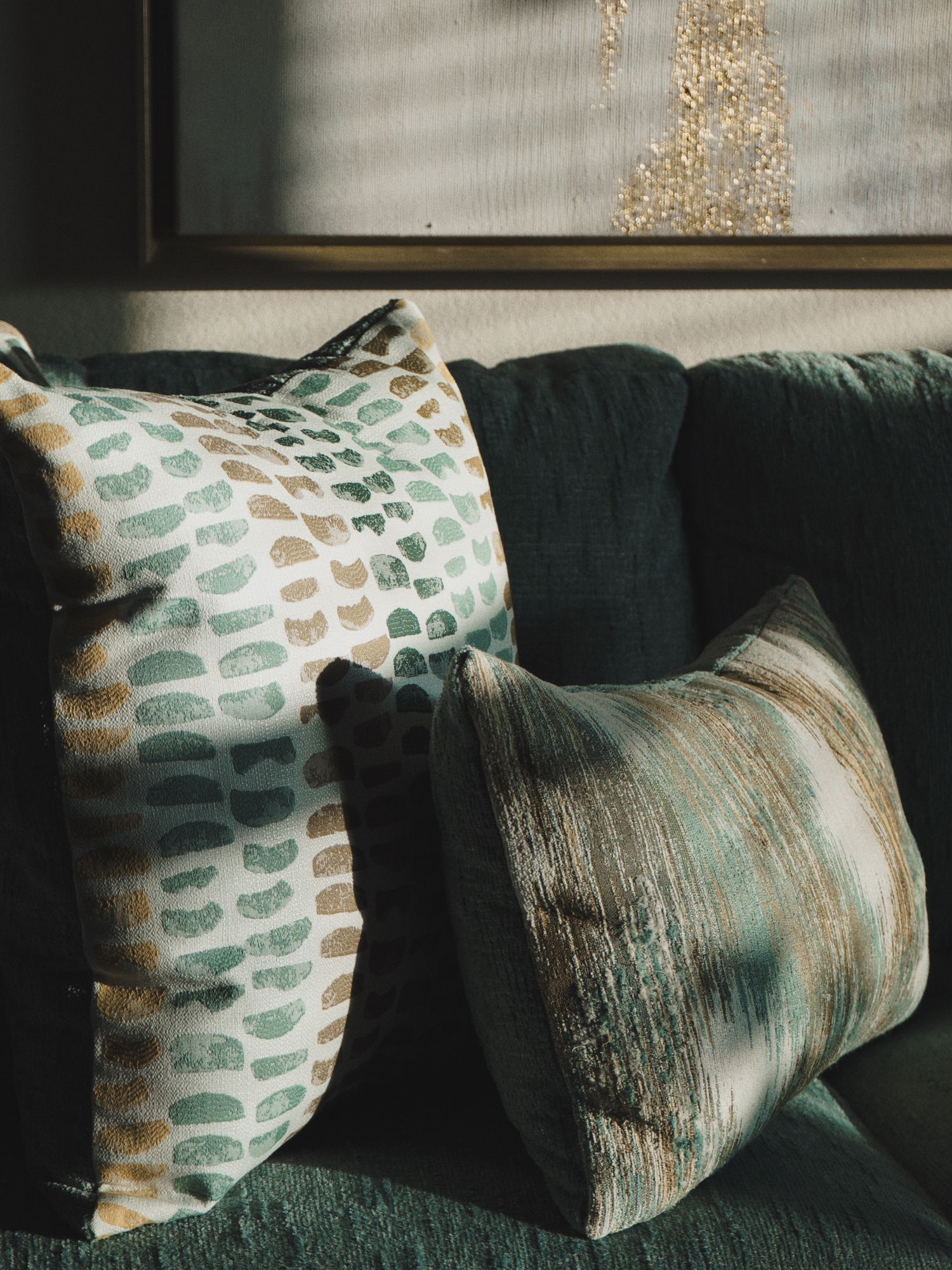
Teal & Terracotta Provide Décor Warmth With A Contemporary Edge
For those who love earthy fall colours but want something more unique in their homes, teal and terracotta provide an appealing compromise by combining cool contrasts and sunbaked warmth.
Add terracotta in pottery, cushions, decorative objects or blankets, and then introduce teal through statement pieces like artwork, chairs or patterned rugs. These two colours beautifully balance each other, and this is particularly the case when surrounded by other warm neutrals like taupe, sand or ivory.
The key here is to keep the intensity of each shade in mind. For instance, muted terracotta pairs well with a smoky teal, as opposed to pairing two high-saturation hues that’ll compete for attention.
Authentic Persian Rugs Add Timeless Character & Colour
One of the most effective ways to experiment with unconventional fall palettes is through area rugs, and authentic Persian rugs just so happen to be particularly effective at this due to their traditional craftsmanship, intricate patterns, and layered colours that work well with modern interiors.
Thankfully these days, finding real Persian rugs online featuring colours like ivory, indigo, burgundy, rust, muted green, and all sorts of other nuanced shades has never been easier. These types of colours can do a great job of connecting unrelated accents, which can make unexpected palettes look much less disjointed.
Because authentic Persian rugs are hand-knotted and feature distinctive designs, each piece inevitably provides its own sense of character to a household space. This means instead of considering a rug as a seasonal accessory, you’ll want to make sure you invest in a lasting design that’ll anchor your home throughout the entire year.
And to make the most of your rug’s colours, consider taking one or two shades from its design and repeating them in things like artwork, pillows, or other decorative accessories. This approach creates a coordinated interior in which every element doesn’t exactly match.
Give Your Home’s Fall Décor A More Personalised Touch
Decorating for fall doesn’t necessarily require you to fill your home with brown accessories and orange pumpkins. By exploring all sorts of unexpected colour combinations, layering tactile materials, and incorporating lasting pieces like real Persian rugs, you’ll inevitably develop an interior design that feels seasonal and doesn’t look predictable.
The best home palettes are the ones that reflect your personal style in ways that make spaces feel more comfortable as days get shorter. So, start with the colours you love, introduce a little contrast, and allow thoughtful details and texture to bring everything else together!
Discover more from FORD LA FEMME
Subscribe to get the latest posts sent to your email.